


A sign of the changing typeface in Paris: out with italics and in with normal.
The typeface of tourist location signs is changing in Paris. The font, the style, the weight, the colour. I wrote a previous article, “Metropolitan to Métro to M – signs at Paris metro stations,” about the Paris Métro station signs gradually evolving from the entire word to only the first letter. Not for the better, in my opinion. Is the same thing happening with tourist location signs – a sneaking change?

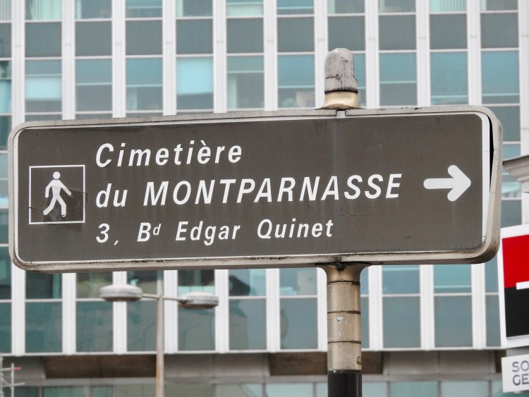
Most signs in Paris are either white writing on a black background or the reverse: black writing on a white background. Some signs are blue with white writing and a few are brown with white writing. CAPITAL letters and lower-case letters. Thick letters. Italic letters. Italic letters have the cursive, slanted, and oblique style, leaning to the right – like this.
Actually, there is a difference between true italics and oblique letters. Oblique letters are slanted, whereas true italics have some changes to the letter forms, most noted in letters such as: a, e, f, g, k, and y.

I began noticing a change in the typeface of directional signs in Paris from about June 2020, and a few more in February 2021. Maybe I had nothing better to do during the 2020 lockdown in the city than to notice tourist signs (and not be permitted to go there)!

The newer signs have the same font as previously – a very clear, no-fuss font that looks like Helvetica to me. Helvetica is the most-used typeface in the world because it is modern and simple. Max Miedinger from Switzerland designed the Helvetica typeface in 1957.


In Paris too, Helevetica typeface has been used for signs for decades. However, the new signs are not in italic letters and they include more CAPITAL letters. I think some have a lighter weight too – they look thinner. The newer signs are mostly black writing on a white background. But now, as a sign of the times, the typeface is out with italics and in with non-italics – referred to as roman, classic, upright, or normal.


Photographer: Martina Nicolls